Poetic Chaos
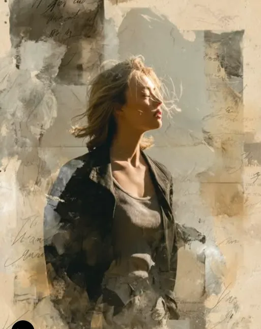
Poetic Chaos: ek cinematic mixed-media look jo instantly attention grab karta hai
Poetic Chaos ek aisa visual style hai jo photo ko sirf image nahi, balki ek mood-board jaisa feel deta hai. Isme cinematic framing, mixed-media textures, aur artistic distortion milkar ek expressive portrait banate hain jo bold bhi hota hai aur dreamy bhi. Agar aap social media content, poster-style portraits, creative editorial looks, ya digital art experiments banana chahte ho, to ye style kaafi useful ho sakta hai.
Read Also: cinematic-style realistic portrait | 2026 New Year
Is type ka prompt un logon ke liye perfect hota hai jo plain portrait se aage jaana chahte hain. Yahan focus sirf face ya pose par nahi, balki overall atmosphere par hota hai — background ki layering, color harmony, light ka soft use, aur composition ka emotional impact. Result ek aisa image look hota hai jo modern, artistic, aur visually rich lagta hai.
Poetic Chaos ka biggest appeal ye hai ki isme realism aur abstraction dono balance me hote hain. Subject clearly visible rehta hai, lekin around the subject visual elements jaise paper textures, paint-like strokes, aur subtle overlays image ko depth dete hain. Isi wajah se ye style creative profiles, fashion visuals, album art inspiration, aur aesthetic storytelling ke liye kaafi popular ho sakta hai.
Poetic Chaos prompt photo style actually kya deta hai?
Is style me sabse pehle jo cheez notice hoti hai woh hai cinematic lighting. Soft sunlight jaisi illumination face ko natural aur warm feel deti hai, jabki gentle shadows image me dimension add karte hain. Iska effect overly edited nahi lagta; instead, portrait me ek calm, poetic, aur slightly dramatic mood create hota hai.
Second major element hai mixed-media layering. Torn paper textures, watercolor washes, ink splashes, aur faint handwritten details background ko flat hone se bachate hain. Ye layers subject ke around visual movement create karti hain, jisse image ek simple photo ki jagah designed artwork jaisi lagti hai.
Color palette bhi is style ka important part hota hai. Usually muted, artistic, aur balanced tones zyada ache lagte hain — jaise soft neutrals, earthy shades, faded blues, warm highlights, ya lightly desaturated colors. Ye palette subject ko highlight karta hai aur background ko expressive banata hai, bina image ko messy kiye.
- Lighting: soft, natural, cinematic, ya diffused light
- Mood: poetic, artistic, free-spirited, reflective
- Texture: paper collage, watercolor effect, ink overlays
- Composition: subject-centered with layered background depth
- Realism: face aur pose realistic, environment stylized
Poetic Chaos photo style ka use kaise karein: beginner-friendly step-by-step guide
Agar aap mobile par kaam kar rahe ho, to bhi is style ko use karna kaafi easy hai. Sabse pehle aapko ek clear portrait ya subject image choose karni hogi. Best results ke liye aisi photo lo jisme face clearly visible ho aur subject ka pose natural lage. Is type ke visual me clarity important hoti hai kyunki layered effects ke beech subject ko strong rehna chahiye.
Uske baad prompt ya style instructions apply karte waqt composition ka idea clear rakho. Aapko image me cinematic feel, artistic collage, aur soft lighting chahiye — yani subject ko background se alag dikhana hai, lekin background ko empty bhi nahi rakhna. Textures aur overlays ka purpose image ko enhance karna hai, dominate karna nahi.
- Ek clear portrait select karo. Face sharp ho, body posture natural ho, aur image blur na ho.
- Vertical format choose karo. 4:5 ya similar portrait framing is style ke liye usually better hoti hai.
- Lighting check karo. Soft daylight, window light, ya evenly lit indoor photo zyada useful hoti hai.
- Background simple rakho. Busy background se collage effects ka impact kam ho sakta hai.
- Style apply karo. Mixed-media layers, watercolor textures, aur soft cinematic shadows ko highlight karo.
- Final image review karo. Subject readable hai ya nahi, colors balanced hain ya nahi, aur textures overdone to nahi — ye zaroor check karo.
Beginner users ke liye ek practical tip ye hai ki pehle simple portrait par experiment karo, phir gradually more artistic backgrounds try karo. Isse aapko samajh aayega ki kitni layering image ko better bana rahi hai aur kab visual clutter create ho raha hai. Mobile screen par preview dekhna especially important hota hai, kyunki small screen par composition ke issues jaldi pakad me aa jate hain.
Kaunsi photos Poetic Chaos style ke liye sabse achchi kaam karti hain?
Is style ke liye best photos woh hoti hain jisme subject ka face clear ho aur expression natural लगे. Side angle, slight three-quarter angle, ya direct gaze — teeno kaam kar sakte hain, bas photo me confidence aur calmness honi chahiye. Aise portraits jisme hair movement ho ya body pose relaxed ho, unme poetic, airy, aur cinematic feel aur strong ho jati hai.
Resolution bhi important hai. High-resolution image better hoti hai kyunki texture overlays aur collage layers ke saath details zyada clean dikhte hain. Low-quality ya heavily compressed photos me edges rough ho sakti hain aur mixed-media effect muddy lag sakta hai. Agar possible ho to well-focused, sharp portrait use karo jisme face aur clothing details clear hon.
Background aur clothing selection bhi final result ko kaafi affect karti hai. Plain background, soft outdoor environment, ya minimal indoor setting zyada workable hoti hai. Clothing ke liye simple, solid-color, ya subtly textured outfits best rehte hain, kyunki overly busy patterns visual balance ko disturb kar sakte hain.
- Best angle: front-facing, three-quarter, ya slight side profile
- Best resolution: sharp, high-resolution, low-noise photo
- Best lighting: soft daylight, golden hour, ya diffused indoor light
- Best background: clean, simple, urban, or minimally textured
- Best clothing: plain, elegant, natural-fabric look, not overly patterned
Agar aap creative portrait editing, aesthetic AI art, ya editorial-style visuals banana chahte ho, to Poetic Chaos ek strong starting point hai. Isme subject ko expressive rakhte hue image ko artistic depth di ja sakti hai, jo normal portrait se kaafi alag aur memorable look create karti hai.
Pro Tips for the Best Om Editing Top Results
Om Editing Top style images work best when you keep the composition balanced but still expressive. Since this look is all about a poetic, artistic feel, small adjustments in pose, lighting, and background texture can make a big difference in the final output.
If you want the subject to stand out naturally, focus on clarity in the face and a clean silhouette. At the same time, let the mixed-media elements do their job in the background so the image feels layered, creative, and visually rich without becoming overcrowded.
- Use soft, directional light to keep the portrait feeling cinematic and gentle.
- Choose one strong focal point, usually the face or upper body, so the image feels organized.
- Ask for visible texture details like paper edges, watercolor washes, or ink-like marks to deepen the artistic look.
- Keep the background abstract enough to avoid distracting from the subject.
- Use natural hair movement or a relaxed pose to add life and realism.
- Balance muted shades with a few bold accents if you want the Om Editing Top effect to pop more.
Another useful tip is to think in layers. The strongest Om Editing Top edits often combine portrait realism with creative visual elements such as torn-paper effects, painted textures, and atmospheric overlays. That layered approach gives the image a more premium, editorial-style finish.
Common Mistakes to Avoid in Om Editing Top
One of the biggest mistakes is adding too many effects at once. If every part of the image is competing for attention, the result can feel messy instead of poetic. Om Editing Top works best when the creative elements support the subject rather than overpowering it.
Another issue is using harsh lighting or overly sharp contrast. This can break the soft, dreamy mood and make the composition feel less cinematic. The same goes for backgrounds that are too busy, because they can reduce the impact of the portrait and weaken the emotional tone.
- Do not overload the design with too many colors, because it can reduce visual harmony.
- Avoid cluttered backgrounds that make the subject blend in too much.
- Do not make the shadows too dark, since the look should stay airy and artistic.
- Avoid stiff poses, because they can weaken the natural, expressive feel.
- Do not use random texture layers without a clear purpose, as they can make the edit look unfinished.
It also helps to avoid inconsistent styling. If the clothing, background mood, and artistic effects do not match, the image may feel disconnected. A strong Om Editing Top edit usually keeps everything in the same visual language, so the final result feels polished and intentional.
Best Use Cases and Creative Ideas
Om Editing Top images are highly versatile, which is why they work well for different kinds of social media and creative branding. The artistic portrait style fits platforms where visual impact matters, especially when you want a post to feel emotional, stylish, and memorable.
These edits are especially useful for Instagram profile pictures, where a unique and expressive portrait can help create a strong first impression. They also work well as thumbnail visuals, because the contrast between the subject and the layered background can attract clicks and stand out in a crowded feed.
- Instagram posts: Ideal for aesthetic feeds, mood posts, and portrait showcases.
- Profile pictures: Great for a creative, confident, and artistic identity.
- Video thumbnails: Useful when you want a visually striking cover image.
- Portfolios: Perfect for artists, photographers, and editors showing their style.
- Reels covers: Helps keep branding consistent with a premium visual mood.
You can also use this style for mood boards, fashion concepts, editorial-inspired content, and personal branding visuals. If your goal is to make the image feel like a digital artwork rather than a simple portrait, Om Editing Top gives you a strong base for experimentation.
Variations You Can Try with Om Editing Top
One of the best things about Om Editing Top is how easy it is to customize. By changing the mood, color palette, season, or setting, you can create a completely different visual story while keeping the same artistic foundation.
If you want a calmer feeling, try softer tones and more minimal background layers. If you want something dramatic, add deeper shadows, stronger contrast, or bolder abstract brushwork. Small changes like these can shift the entire emotion of the image.
- Mood variations: dreamy, confident, melancholic, romantic, bold, or mysterious.
- Colour variations: warm beige, dusty pink, blue-gray, earthy brown, or deep black accents.
- Setting variations: urban walls, textured studio backdrops, open streets, or symbolic abstract spaces.
- Season variations: soft summer light, rainy monsoon tones, golden autumn shades, or cool winter atmospheres.
- Style variations: more painterly, more cinematic, more collage-like, or more editorial.
You can also experiment with the level of motion in the hair, the amount of handwritten texture in the background, and the intensity of the sunlight. These details may seem small, but they shape how polished, emotional, and premium the Om Editing Top result feels.
Conclusion: Try Om Editing Top for a Poetic Visual Style
Om Editing Top is a strong choice when you want an image that feels artistic, emotional, and visually layered. It blends portrait realism with creative mixed-media details, making it suitable for social posts, profile images, thumbnails, and portfolio visuals.
If you want to create something that looks expressive and modern at the same time, this style is worth experimenting with. Try different moods, colors, and backgrounds until the final image matches your personal taste, and let Om Editing Top become your go-to look for poetic, standout edits.
💬 Comments