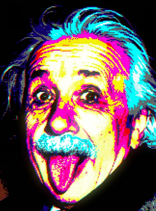
Neon Pixel Relic
Neon Pixel Relic: ek retro digital art style jo instantly attention grab karta hai
Neon Pixel Relic ek aisa visual style hai jo 1980s aur 1990s ke old-school computer graphics ko modern creator tools ke saath merge karta hai. Isme image smooth aur polished nahi hoti, balki blocky, chunky, pixel-based feel ke saath aati hai jo MS-DOS ya Windows 3.1 era ki yaad dila deti hai.
Read Also: cinematic-style realistic portrait | 2026 New Year
Ye style un logon ke liye perfect hai jo retro-futuristic artwork, cyber aesthetics, game-inspired visuals, ya nostalgic digital posters banana chahte hain. Agar aap social media graphics, cover art, concept visuals, thumbnails, ya experimental digital posters ke liye unique look dhoond rahe hain, to Neon Pixel Relic ek strong choice hai.
Is style ki sabse badi strength iska “old computer but visually striking” effect hai. Simple shapes, limited colours, visible pixel structure, aur glowing highlights milkar ek aisi image banate hain jo simultaneously vintage bhi lagti hai aur futuristic bhi.
Neon Pixel Relic style aapko exactly kya deta hai?
Is prompt/photo style ka output generally dark background ke saath aata hai jahan bright neon colours zyada pop karte hain. Black base ki wajah se pink, cyan, electric blue, purple, aur acid green jaise shades aur zyada vivid lagte hain. Result ek dramatic, high-contrast visual hota hai jo instantly eye-catching hota hai.
Composition usually centered hoti hai, matlab main subject frame ke beech me dominate karta hai. Isme 60-70% frame coverage ka feel hota hai, jisse artwork bold aur poster-like dikhta hai. Complex gradients ki jagah flat colour blocks aur simple transitions use hote hain, so overall image intentionally low-res, chunky, aur pixel-heavy lagti hai.
Is style ka mood moody, synthetic, nostalgic, aur slightly sci-fi hota hai. Visual details jaise scanlines, RGB subpixel grid, chromatic fringing, glow, bloom, moiré patterns, aur subtle dust artifacts image ko authentic retro computer feel dete hain. Ye cheezein image ko “modern AI art” se alag karke “old digital artifact” jaisa character deti hain.
- Lighting: self-illuminated neon glow, soft bloom, dark surroundings
- Colours: limited palette, vibrant but controlled tones, high contrast
- Composition: centered subject, minimal distraction, strong visual focus
- Texture: visible pixels, scanlines, slight noise, edge fringing
- Mood: retro, synthetic, moody, nostalgic, arcade-inspired
Neon Pixel Relic kaise use karein: beginner-friendly step-by-step guide
Agar aap mobile phone par kaam kar rahe hain, to bhi is style ko use karna simple hai. Sabse pehle aapko apni reference photo ya subject clear rakhna hoga. Ye style tab best kaam karta hai jab main object simple ho aur uska shape pehchaanne layak ho.
Phir aap apne editing tool ya AI image workflow me prompt ko apply karte hain. Yahan important baat ye hai ki aap output ko retro pixel art direction me le jaayein, na ki realistic photo direction me. Iska matlab hai ki aapko chunky pixels, black background, glow effects, aur old-school digital graphics feel ko prioritize karna chahiye.
- Subject choose karein: ek simple object, portrait, icon, ya game-style visual select karein.
- Frame center karein: main subject ko image ke beech me rakhein taaki composition strong rahe.
- Background dark rakhein: black ya near-black background neon colours ko aur highlight karega.
- Colours limited rakhein: 4-16 vibrant colours ke andar rehne ki koshish karein.
- Pixel detail preserve karein: image ko over-smooth ya over-sharpen na karein.
- Glow add karein: bright edges aur light bloom se retro digital feel aur strong hoti hai.
- Artifacts check karein: scanlines, noise, moiré, aur slight fringing naturally visible honi chahiye.
- Final preview dekh kar adjust karein: agar image too modern lag rahi hai, to contrast aur pixelation badhayein.
Kaunsi photos Neon Pixel Relic ke liye sabse achchi kaam karti hain?
Is style ke liye woh photos sabse better hoti hain jisme subject ka silhouette clear ho. Close-up portraits, product shots, symbolic objects, futuristic props, ya simple character images achha result deti hain. Agar photo already too busy hai, to pixelated output cluttered lag sakta hai.
Lighting bhi important hai. Soft but defined light, strong edges, ya studio-style illumination is look ko help karti hai. Very dark, blurry, ya underexposed source images me details lose ho sakte hain, isliye clean source material use karna better hota hai. Background jitna simple hoga, retro digital transformation utni polished lagegi.
Clothing aur textures ke case me simple shapes best rehte hain. Solid-colour jackets, sharp collars, clean outlines, aur geometric patterns pixel style me achhe translate karte hain. Tiny intricate details, overly complex prints, ya noisy backgrounds often reduce visual clarity.
- Angle: front-facing ya slightly angled composition best रहती है
- Resolution: clear source photo use karein, even if final output low-res look de
- Lighting: balanced light, strong highlights, deep shadows where needed
- Background: plain, dark, or minimal background ideal hota hai
- Clothing: simple silhouettes, bold colours, fewer tiny details
- Subject type: portraits, objects, logos, gadgets, sci-fi elements, arcade-style visuals
Neon Pixel Relic ka charm isi baat me hai ki ye intentionally imperfect lagta hai. Agar aap retro computing, synthwave energy, ya old digital art ki vibe create karna chahte hain, to ye style aapko ek strong visual identity deta hai. Sahi subject, sahi background, aur clean composition ke saath iska result kaafi memorable ho sakta hai.
Pro tips for the best results with Om Editing Top
To get the strongest output from Om Editing Top, start by keeping your request simple but specific. The more clearly you describe the mood, colours, and subject, the easier it becomes for the edit to look intentional instead of random. Since this style depends on pixel structure and a retro digital feel, short and clear direction usually works better than overloading the prompt with too many effects.
If you want a cleaner result, focus on one main visual idea and then add only a few supporting details. For example, you can ask for a centered composition, a black background, or a neon glow, but avoid stacking too many conflicting styles at once. That balance helps the final image stay sharp, readable, and visually nostalgic.
- Keep the subject simple so the pixel art structure stays clear and bold.
- Use strong contrast, especially when you want neon colours to stand out on a dark background.
- Ask for a centered composition to make the design feel more polished and iconic.
- Try one dominant colour family first, then add accents for depth and energy.
- Use retro digital cues like scanlines, glow, and pixel texture to strengthen the old-school look.
- Test small variations in saturation and brightness to find the most striking version.
Another useful tip is to think about how the image will be viewed. If it is meant for a profile picture, thumbnail, or social post, the subject should remain readable even at a smaller size. That is where Om Editing Top works especially well, because a strong centre focus and limited palette can keep the design clean and memorable.
Common mistakes to avoid in Om Editing Top edits
One of the biggest mistakes is asking for too much detail. This kind of edit works best when the image feels blocky, retro, and digitally simplified. If you request overly realistic textures, complex lighting, or modern 3D effects, the result can lose the authentic early-computer style that makes Om Editing Top interesting in the first place.
Another common issue is using too many colours or too many visual effects at once. A palette that is too wide can make the image feel messy instead of nostalgic. Likewise, too many glows, reflections, and extra elements can overwhelm the pixel grid and reduce the impact of the main subject.
- Avoid overcrowding the frame, because too many objects make the composition feel weak and unclear.
- Do not mix modern glossy effects with retro pixel styling, or the result may look inconsistent.
- Do not use a large number of colours if you want an authentic old-school computer graphics feel.
- Avoid weak contrast, because neon details need darkness around them to stand out.
- Do not ignore background simplicity; a busy backdrop can destroy the floating-digital look.
- Avoid vague wording, because unclear requests often lead to generic results instead of a distinct style.
It also helps not to over-edit after the image is generated. The charm of this style comes from its raw, imperfect digital character. If you keep tweaking it too much, you may lose the chunky, nostalgic quality that gives Om Editing Top its visual identity.
Best use cases and ideas for Om Editing Top images
Om Editing Top images are great for social media because they stand out instantly. The neon-on-black look works especially well for Instagram posts, story highlights, and profile pictures where you want a sharp, memorable visual identity. Since the style is bold and minimal, it can grab attention quickly without looking crowded.
These edits also work nicely for thumbnails, cover images, and reels covers. A centered subject with glowing pixels is easy to recognise even on small screens, which makes it useful for content creators who want a consistent and attractive theme. The retro digital look can also help your posts feel more unique compared with standard modern edits.
- Instagram posts: use it for aesthetic feeds, retro-themed content, or standout visual branding.
- Profile pictures: choose a strong central subject so the image remains readable in a small circle.
- Thumbnails: make the glow and contrast stronger for quick attention on busy feeds.
- Portfolio pieces: show off creative editing skills with a distinct old-computer style.
- Reels covers: create a unified look across multiple videos.
You can also use this style for digital art collections, tech-inspired posters, music visuals, and mood boards. Because Om Editing Top is flexible, it can support both playful and dramatic themes. That makes it useful for anyone building a personal brand, a creative page, or a nostalgic design series.
Variations you can try with Om Editing Top
One of the best things about Om Editing Top is how easily it can be adjusted to different moods. You can keep the same retro digital base but change the atmosphere by shifting the colour palette, background tone, or glow style. Small changes often make a big difference in how the image feels.
For a more energetic look, try brighter neon colours like electric blue, magenta, cyan, or lime. If you want something darker and moodier, reduce the brightness and use deeper purples, reds, or icy tones. You can also change the setting idea without losing the core pixel-art identity, which gives you more room to experiment.
- Colour variations: neon pink, acid green, electric blue, purple haze, amber glow.
- Mood variations: futuristic, mysterious, dreamy, glitchy, nostalgic, high-energy.
- Seasonal ideas: winter frost tones, summer neon warmth, autumn amber, rainy cyber-night.
- Background styles: pure black, dark gradient-like depth, noisy void, faint starfield digital space.
- Glow styles: soft bloom, hard-edge light, layered haze, subtle colour bleed.
You can also test different subject types while keeping the same visual language. Try abstract symbols, futuristic icons, character portraits, or tech-like forms. Each variation can make Om Editing Top feel fresh while still preserving the retro pixel structure and authentic digital atmosphere.
Conclusion: why Om Editing Top is worth trying
Om Editing Top is a strong choice if you want a retro-futuristic image that feels bold, nostalgic, and easy to recognise. The mix of pixel detail, neon glow, dark background, and old-computer aesthetics creates a look that stands out across social media and creative projects. It is simple enough to stay clean, yet distinctive enough to feel special.
If you want a design style that looks different from modern polished edits, this is a great option to explore. Try a few variations, adjust the mood, and see how the same concept can feel fresh in new colours and settings. With Om Editing Top, small changes can completely change the personality of the image.
💬 Comments