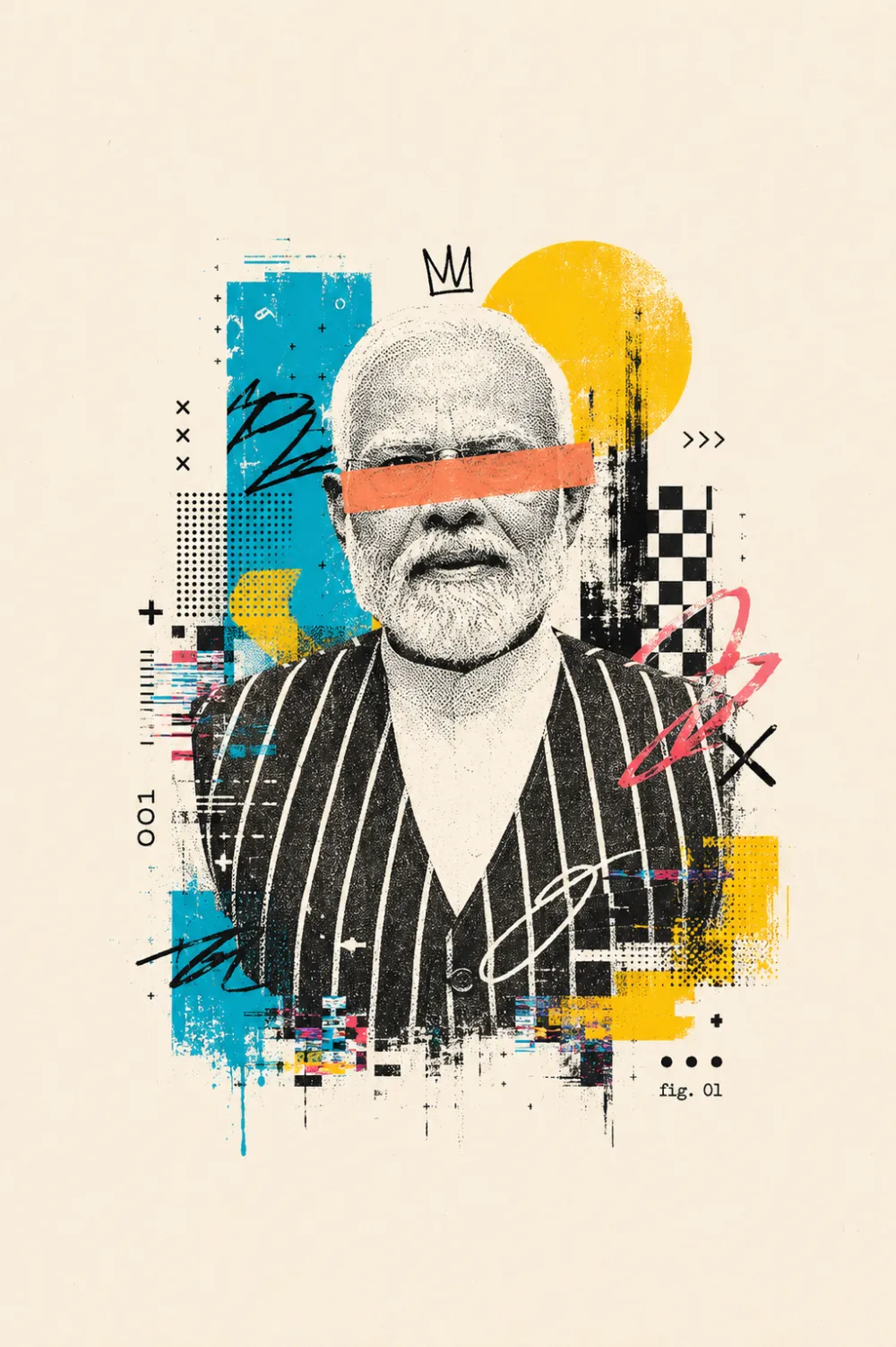
minimal chic aesthetic
Minimal Chic Aesthetic with Om Editing Top: What This Style Is About
Om Editing Top style ka minimal chic aesthetic un logon ke liye perfect hai jo clean, modern aur visually striking poster look chahte hain. Isme subject ko center stage par rakha jata hai, lekin overall design crowded nahi hota. White, cream ya off-white background ke saath negative space ko open rakha jata hai, jisse image premium, editorial aur gallery-like feel deti hai.
Read Also: cinematic-style realistic portrait | 2026 New Year
Ye style un creators, designers, social media editors aur brand pages ke liye useful hai jo high-fashion ya art-inspired visual banana chahte hain. Minimal chic aesthetic ka main idea hota hai simple frame me strong presence create karna. Isme details controlled hoti hain, but impact bold hota hai.
Agar aap Om Editing Top prompt ya similar photo edit use kar rahe hain, to result usually surreal yet clean dikhta hai. Is type ke visual me mixed media, texture overlays aur geometric accents ka balance hota hai, lekin composition still refined rehti hai. Isi wajah se ye fashion posts, digital posters, promo creatives aur concept art ke liye kaafi popular hai.
This Style Me Aapko Kya Visual Output Milta Hai
Is prompt-style ka output sirf ek normal portrait nahi hota. Aapko ek editorial collage effect milta hai jisme subject ko artistic layers ke through transform kiya jata hai. High-contrast black and white textures, grainy paper feel aur vibrant accent colors image ko modern poster aesthetic dete hain.
Composition usually centered hoti hai aur frame ke around kaafi clean space chhoda jata hai. Isse subject aur stronger lagta hai. Background simple cream ya off-white tone me hota hai, jo overall look ko soft, premium aur minimal banata hai. Bold shapes, glitch effects aur tape-like blocks image me deconstructed feel add karte hain.
Ye visual style un logon ko appeal karta hai jo fashion editorial, avant-garde design, modern art collage ya luxury branding vibe create karna chahte hain. Minimal chic look ka best part ye hai ki wo cluttered nahi hota, phir bhi highly expressive hota hai.
- Lighting: soft but high-contrast look, taa ki textures clearly pop karein
- Mood: modern, artistic, premium, slightly surreal
- Colours: black-white base ke saath cyan, yellow, pink ya orange accents
- Composition: strictly centered subject with wide negative space
- Finish: grainy, poster-like, mixed media editorial feel
This Style Prompt Ko Mobile Par Kaise Use Karein
Agar aap beginner hain aur mobile se edit banana chahte hain, to process simple rakhiye. Pehle ek aisi photo choose karein jisme subject clear ho aur face ya main object properly visible ho. Phir us image ko editor ya AI tool me upload karke same style direction use karein jo minimal chic editorial look deta hai.
Sabse important step hota hai composition ko open rakhna. Subject ko center me rakhna hai, lekin frame ko overfill nahi karna. Background clean hona chahiye aur unwanted objects remove karne chahiye. Agar app me canvas size ya spacing control milta hai, to extra whitespace jarur rakhein.
Mobile users ke liye best workflow ye hai ki pehle basic crop aur brightness set karein, phir texture ya collage effect apply karein. Uske baad final image ko zoom karke check karein ki subject cut na hua ho aur negative space balanced ho.
- Apni best photo select karein jisme subject sharp aur clear ho.
- Image ko mobile editor me open karke crop ko centered rakhein.
- Background ko as clean as possible rakhein, clutter hata dein.
- Style effect ya AI transformation apply karein.
- Result me check karein ki contrast, grain aur color accents balanced hain ya nahi.
- Agar frame crowded lage, to spacing aur brightness thodi adjust karein.
Kaunsi Photos This Style Minimal Chic Aesthetic Ke Liye Best Hain
Is style ke liye har photo equally suitable nahi hoti. Best results tab milte hain jab subject ka angle simple ho aur face ya main object poori tarah visible ho. Front-facing ya slightly angled portraits often achhe kaam karte hain, kyunki centered layout me subject clearly standout karta hai.
Resolution achhi honi chahiye, warna textures blur ho sakte hain aur final look cheap lag sakta hai. Natural light ya soft studio light best hoti hai, because harsh shadows mixed media effect ke saath clash kar sakti hain. Background jitna plain hoga, utna hi clean minimal chic result milega.
Clothing aur styling bhi matter karti hai. Solid colours, simple silhouettes aur clutter-free outfits style ko better support karte hain. Very busy prints ya too many accessories image ko noisy bana sakte hain. Agar aap editorial poster feel chahte hain, to clean outfit aur strong pose choose karein.
- Angle: front-facing ya slight three-quarter pose
- Resolution: high-quality, sharp, uncompressed image
- Lighting: soft natural light, diffused studio light, or even lighting
- Background: plain, light-colored, uncluttered, distraction-free
- Clothing: solid tones, minimal accessories, clean fashion styling
- Pose: stable, centered, expressive but not overly busy
Pro tips for the best Om Editing Top results
If you want the cleanest Om Editing Top look, focus on balance first. The style works best when the subject stays fully visible, centered, and surrounded by plenty of negative space. That open, airy composition is what gives the design its minimal chic appeal and makes the artwork feel premium instead of crowded.
Another important tip is to guide the contrast carefully. The black-and-white foundation should stay sharp, while the accent colours should feel intentional, not random. When the highlights, tape effect, and graphic overlays are placed with purpose, the final image looks more editorial and polished.
- Keep the subject perfectly centered to preserve the minimal layout.
- Use strong black-and-white texture contrast before adding colour accents.
- Leave generous cream or off-white background space around the artwork.
- Mix only a few bold design elements so the image stays clean and chic.
- Choose one dominant accent colour and let the rest support it.
- Make sure the full composition fits inside the frame without cropping.
- Use glitch, graffiti, or halftone details sparingly for a more refined finish.
If you are aiming for a more premium social media edit, test the output at different sizes before posting. An Om Editing Top image should still look strong as a profile picture, post cover, or small thumbnail. If the details disappear when scaled down, simplify the design and reduce visual noise.
Common mistakes to avoid in This edits
A common mistake is overloading the composition with too many colours or patterns. The phrase Om Editing Top suggests a stylish, minimal aesthetic, so clutter can quickly ruin the visual identity. Too many overlays may make the image feel messy instead of modern and artistic.
Another frequent issue is cropping the subject too tightly. Since this style relies on clean spacing and a centered frame, cutting off the edges breaks the balanced look. The artwork should feel contained, with breathing room on every side so the minimal chic effect remains intact.
- Too much texture: It can overpower the subject and make the design hard to read.
- Random colour mixing: Uncontrolled colours reduce the refined editorial feel.
- Overcrowded overlays: Excess scribbles, glitch marks, or shapes can make the image look noisy.
- Improper framing: Cropping the subject breaks the centered composition and weakens the layout.
- Flat backgrounds without contrast: If everything looks the same tone, the image loses depth and impact.
- Ignoring the minimalist look: Adding too many elements defeats the whole purpose of the style.
It also helps to avoid forcing every trend into one design. A strong Om Editing Top result works because it feels curated, not overloaded. Keep the structure simple, then use selective details to make the image feel creative, modern, and visually striking.
Best use cases and ideas for These images
The Om Editing Top style is perfect when you want your visuals to stand out while still looking clean and trendy. Its minimal chic aesthetic makes it suitable for Instagram posts, story covers, and profile visuals where first impressions matter. The centered layout and bold contrast also make it very effective for personal branding.
This style works especially well for people who want a creative but polished look. It can be used for profile pictures, thumbnail art, reel covers, or portfolio previews. Because the background stays open and simple, the subject remains the main focus, which is ideal for digital platforms with small display sizes.
- Instagram posts: Great for aesthetic feeds, announcement graphics, or stylish profile content.
- Profile pictures: The centered composition helps the subject remain readable even in a small circle crop.
- Thumbnails: Bold contrast and graphic texture make the image eye-catching for videos or tutorials.
- Portfolio covers: Useful for designers, editors, and creators who want a modern visual identity.
- Reels covers: Works well when you need a neat, branded cover that still feels artistic.
You can also use this format for mood boards, digital posters, event teasers, or fashion-inspired editorial posts. If your goal is to make content look minimal yet expressive, Om Editing Top gives you a flexible visual style that can adapt to both personal and professional use.
Variations you can try with This Style
One of the best things about this style is that you can change the mood without losing the clean aesthetic. Small shifts in colour, lighting, or texture can completely change the vibe while keeping the same core structure. That makes it easy to create multiple versions for different platforms or themes.
If you want a softer look, try muted tones and lighter overlays. For a bolder version, increase contrast and use stronger accent colours. You can also switch the feeling of the design by adjusting the background, seasonal palette, or the type of graphic textures used in the composition.
- Moody version: Darker shadows, sharper contrast, and deeper accent tones for a dramatic feel.
- Soft minimal version: Gentle halftone textures with subtle colour blocks and a calmer palette.
- Neon version: Brighter cyan, pink, or yellow accents for a more energetic modern style.
- Vintage-inspired version: Grainier paper texture and muted tones for a poster-like finish.
- Seasonal version: Warm tones for summer or autumn, cooler tones for winter, and fresh pastel accents for spring.
- Editorial version: Cleaner spacing, refined overlays, and a more fashion-magazine aesthetic.
You can also experiment with background warmth, tape colour, and the intensity of glitch details. Even small changes can make the same this prompt concept feel more unique, so it is worth creating several variations until you find the one that matches your brand or post style.
Conclusion: why This Style is worth trying
this look is a strong choice if you want a design that feels modern, artistic, and minimal at the same time. Its mix of bold contrast, open space, and carefully placed graphic details makes it suitable for a wide range of creative uses without losing its clean aesthetic.
If you are looking to create images for Instagram, thumbnails, profile pictures, or portfolio covers, this style gives you plenty of room to experiment while still keeping the final result polished. Try different colours, moods, and textures, and refine the layout until the composition feels balanced and premium.
With the right setup, yeh style can turn a simple idea into a stylish visual that feels fresh, unique, and easy to remember. If you enjoy minimal chic design with a creative edge, this is definitely a style worth testing in your next edit.
💬 Comments