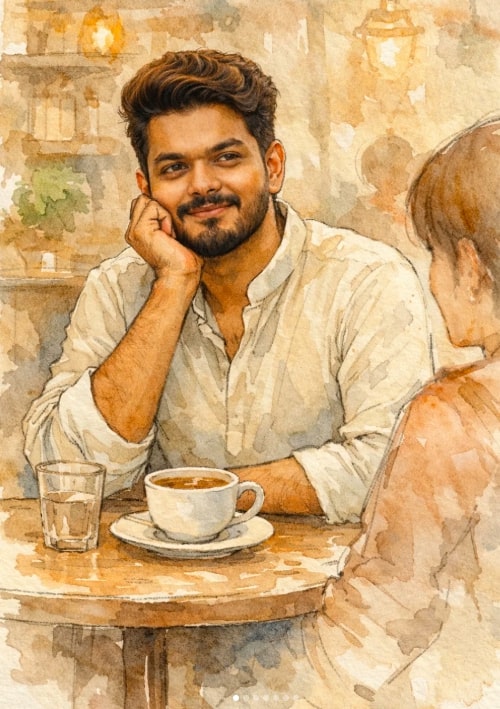
Soft Watercolor Café Portrait Illustration
Om Editing Top: Soft Watercolor Café Portrait Illustration ka Introduction
Om Editing Top style ka yeh Soft Watercolor Café Portrait Illustration un logon ke liye hai jo apni photo ko ek warm, artistic, aur emotionally rich illustration me dekhna chahte hain. Is look me ordinary portrait ko ek cozy café moment me convert kiya jata hai, jahan watercolor softness aur ink-line detailing milkar ek poetic feel create karti hai.
Read Also: cinematic-style realistic portrait | 2026 New Year
Ye style especially un users ke liye useful hai jo apni natural facial identity ko preserve karte hue ek premium hand-drawn vibe chahte hain. Agar aap apni image ko realistic rakhte hue artistic touch dena chahte hain, to Om Editing Top prompt style aapko ek aisa result de sakta hai jo social media profile, digital art collection, ya personal keepsake ke liye kaafi elegant lagta hai.
Is visual approach ka biggest advantage yeh hai ki yeh over-edited ya artificial nahi lagta. Face ke natural tones, soft mood, aur subtle café atmosphere milkar image ko intimate aur classy बनाते hain. Isi wajah se yeh portrait editing style beginners aur creative editors dono ke liye popular ho sakta hai.
This Style Me Yeh Prompt/Photo Look Kya Deta Hai
Is type ki illustration ka main focus hota hai soft realism aur gentle artistic treatment. Watercolor texture image ko dreamy bana deti hai, jabki ink outline subject ke facial structure aur pose ko readable rakhti hai. Result ek aisa portrait hota hai jo fully painted bhi लगता hai aur photo-based also feel hota hai.
Visual mood generally calm, intimate, aur emotional hota hai. Café setting me muted tones, warm light, aur minimal background clutter use kiya jata hai taaki attention subject par rahe. Face ko extra bright nahi kiya jata, isliye natural skin tone aur original identity intact rehti hai, jo is style ko zyada authentic बनाती hai.
Colour palette usually soft aur understated hoti hai, jaise ivory, beige, dusty blue, muted peach, ya other pastel shades. Composition me subject ko table ke paas candid pose me dikhaya jata hai, with one hand supporting the face and a relaxed expression. Background me blurred second figure ya minimal café props depth add karte hain without distracting from the main portrait.
- Lighting: soft, natural, and evenly diffused
- Mood: cozy, thoughtful, affectionate, intimate
- Colours: pastel, muted, earthy, watercolor-friendly
- Composition: centered subject, small café table, subtle background
- Realism: natural face tone preserved, no harsh retouching
This Style Ko Mobile Par Kaise Use Karein: Step-by-Step Guide
Agar aap beginner hain, to bhi is style ko use karna difficult nahi hai. Sabse pehle aapko ek clear, front-facing ya slightly angled photo select karni hogi jisme face sharp ho. Mobile par editing karte waqt focus hamesha image quality, face clarity, aur natural lighting par rakhna chahiye.
Uske baad aap apni chosen image ko upload karke watercolor café illustration style apply karte hain. Best results tab milte hain jab photo me expression relaxed ho aur pose dramatic na ho. Candid, natural-looking images is format me zyada achhe se translate karti hain.
Niche ek simple mobile-friendly workflow diya gaya hai jo follow karna easy hai:
- Apni best face photo choose karein jisme blur na ho aur face clearly visible ho.
- Photo ko crop karein taki subject center me rahe aur unnecessary background kam ho.
- Image ko editor ya AI tool me upload karein jahan watercolor illustration effect apply hota ho.
- Prompt/style select karte waqt cozy café, soft ink, pastel tones, aur natural facial tone jaise elements dhundhein.
- Preview me check karein ki skin tone extra bright na ho aur facial details intact rahein.
- Agar face over-smoothed ya overexposed lag raha ho, to strength ko thoda reduce karein.
- Final output save karein aur high-resolution version download karein.
- Ek hi photo par multiple variations try karein
- Different lighting versions compare karein
- Face ke around unnecessary filters avoid karein
- Background ko simple aur clean rakhein
This Style Ke Liye Kaunsi Photos Sabse Achhi Kaam Karti Hain
Is style me sabse achha result tab aata hai jab source photo clear, natural, aur well-lit ho. Face angle thoda candid ho sakta hai, lekin features visible hone chahiye. Direct harsh flash ya extreme shadow wali images watercolor conversion me inconsistent output de sakti hain.
Resolution bhi important hai, kyunki low-quality image me ink lines aur facial details mushkil se preserve hote hain. Agar aap chahte hain ki café portrait elegant aur premium lage, to aisi photo choose karein jisme face, hair, aur clothing details crisp hon. Background jitna simple hoga, final illustration utni clean dikhegi.
Clothing ke liye simple kurta, cotton shirt, ya muted pastel outfit best rehta hai, kyunki yeh watercolor palette ke saath naturally blend ho jata hai. Busy prints, strong logos, ya flashy accessories is look ko distract kar sakte hain, isliye minimal styling zyada effective hoti hai.
- Angle: front-facing ya slight side angle
- Resolution: high-quality, sharp, non-blurry image
- Lighting: soft daylight or evenly lit indoor light
- Background: plain, uncluttered, or easy to replace
- Clothing: light kurta, simple shirt, pastel or earthy tones
- Expression: relaxed, warm, natural smile or soft gaze
Om Editing Top: Pro Tips for the Best Results
Om Editing Top results look best when the edit feels soft, natural, and emotionally balanced. Since this kind of watercolor café portrait depends on atmosphere, the goal is not to overdo effects. Keep the face true to the original look, preserve the natural skin tone, and let the illustration style do the artistic work. That is what gives the final image its calm, premium feel.
If you want the most polished output, focus on small details that shape the whole scene. A relaxed pose, clean composition, and gentle café lighting can make the portrait feel intimate without looking crowded or artificial. The best Om Editing Top versions usually feel like a quiet moment captured in a hand-painted frame.
Here are a few practical do’s that improve the final result:
- Use a clear face reference so facial structure stays accurate and recognizable.
- Keep the lighting soft and even, especially if you want a watercolor illustration that feels warm and elegant.
- Choose muted clothing colors like beige, ivory, dusty blue, or pastel tones for a refined café aesthetic.
- Leave enough negative space around the subject so the scene does not feel too busy.
- Use subtle expressions instead of dramatic emotions for a more realistic portrait illustration.
- Keep props minimal so the cup, table, and background support the subject instead of competing with it.
Another useful tip for Om Editing Top is to think about the final use before finalizing the edit. If the image is meant for Instagram, a stronger face focus and cleaner framing often work better. If it is for a portfolio or profile image, a balanced composition with soft background details can make the artwork feel more premium and timeless.
Common Mistakes to Avoid in This Style
Even a beautiful concept can lose its charm if too many elements are pushed too hard. The most common mistake in Om Editing Top edits is over-enhancing the face. When brightness, skin smoothing, or stylization becomes too strong, the portrait stops feeling natural and may no longer match the original reference well.
Another issue is overcrowding the café scene. This style works because it feels intimate and quiet. If the table has too many objects, the background has too much detail, or the second figure becomes too visible, the image may lose the soft hand-drawn mood that makes the illustration special.
- Too much face brightening: This can erase the natural dark tone and make the portrait look unrealistic.
- Over-detailed background: Busy décor distracts from the subject and weakens the cozy café feeling.
- Harsh colors: Very saturated tones can break the soft watercolor style and make the image feel less organic.
- Strong facial retouching: Heavy smoothing may remove expression, texture, and natural identity.
- Cluttered composition: Too many props reduce the elegance of the scene and make the final artwork feel noisy.
- Unnatural pose: A stiff or forced posture can damage the candid, intimate mood of the portrait.
Keeping the edit simple is often the smartest choice. Om Editing Top works best when the details are controlled, the expression stays soft, and the illustration looks like a genuine café moment rather than an overprocessed design.
Best Use Cases and Ideas for This Style
Om Editing Top is versatile because it combines portrait realism with a hand-painted artistic style. That means it can be used in many places where a refined, thoughtful image is needed. It works especially well when you want the portrait to feel personal, creative, and visually memorable.
One of the strongest use cases is Instagram. A soft watercolor café portrait stands out in a feed because it looks different from standard filters or heavy edits. It also works nicely as a profile picture when the goal is to keep the face identifiable while still adding a creative artistic touch.
You can also use this style for:
- Instagram posts: Great for lifestyle, personal branding, or artistic profile content.
- Profile pictures: Ideal when you want a soft but recognizable avatar.
- YouTube thumbnails: Useful for creative channels that need a warm, illustrated look.
- Portfolios: Adds a polished portrait piece that feels more unique than a standard photo.
- Reels covers: Helps create a consistent and attractive visual theme.
- Story highlights: Works well for custom highlight covers with a café or soft-art mood.
This style also suits gifting, digital art collections, and personal keepsakes. If someone wants a portrait that feels calm, artistic, and emotionally connected, Om Editing Top can be a strong choice. The café setting makes it especially fitting for content around friendship, reflection, journaling, or quiet everyday moments.
Variations You Can Try with This Style
One reason this style is so useful is that it can be adapted in many directions without losing its core identity. You can keep the same portrait concept but change the mood, season, or color palette to make each version feel fresh. This is helpful if you want to test different looks before choosing the best final result.
For a warmer feel, use soft peach, cream, or light brown tones in the clothing and café décor. If you want something cooler and more modern, dusty blue, grey-beige, or muted green can create a calm editorial look. Seasonal changes also work well, especially when the background stays minimal and the watercolor textures remain gentle.
- Morning café mood: Add soft daylight, pale highlights, and a peaceful early-day atmosphere.
- Evening mood: Use warmer lamp light and deeper shadows for a cozy, reflective feeling.
- Rainy season variation: Add a subtle window backdrop or soft grey-blue tones for a thoughtful vibe.
- Autumn look: Bring in muted amber, beige, and brown shades for a richer café palette.
- Spring version: Use lighter pastels and airy surroundings for a fresh, gentle portrait.
- Minimal studio-café blend: Keep the café idea but simplify the background for a cleaner modern composition.
You can also experiment with mood changes in the expression and posture. A slight smile feels warm and approachable, while a more thoughtful look creates depth and quiet charm. Small shifts like these can give this prompt a completely different personality without changing the overall concept.
Conclusion: Try This Style for a Soft Artistic Portrait
This look is a beautiful choice when you want a portrait that feels personal, calm, and visually refined. The watercolor café style brings together natural expression, soft colors, and a cozy atmosphere in a way that feels elegant and memorable.
If you want an image that keeps the subject realistic while adding a hand-drawn artistic touch, yeh style is worth trying. Experiment with different moods, colors, and subtle background details until you find the version that best matches your style.
💬 Comments