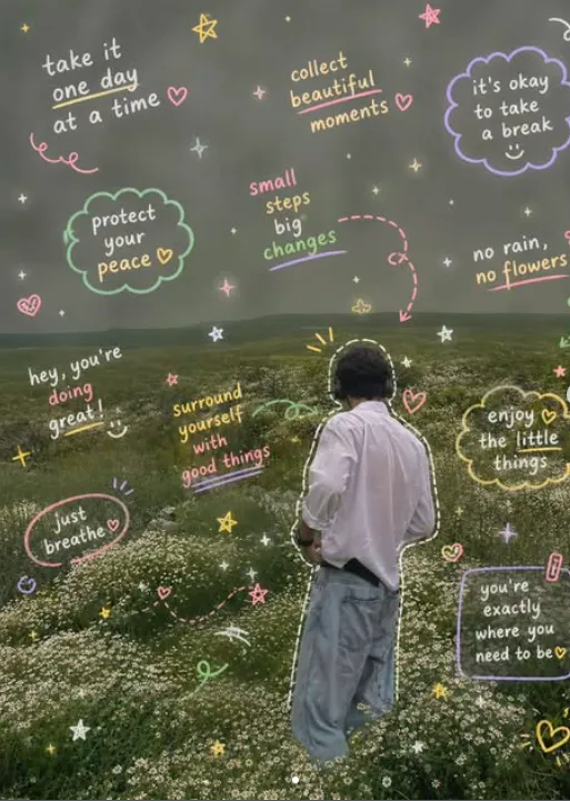
Pastel Scribbles
Om Editing Top के साथ Pastel Scribbles स्टाइल क्या है?
Om Editing Top में Pastel Scribbles एक ऐसा playful visual style है जो आपकी फोटो, डिजाइन या सोशल मीडिया पोस्ट को hand-drawn notes जैसे feel देता है। इसमें pastel रंगों की scribble lines, छोटे arrows, swirl shapes, cute annotations और casual handwritten look का mix होता है, जिससे पूरी इमेज ज्यादा friendly, creative और eye-catching लगती है।
Read Also: cinematic-style realistic portrait | 2026 New Year
यह स्टाइल खास तौर पर उन लोगों के लिए useful है जो अपनी photos को simple edit से आगे ले जाकर expressive बनाना चाहते हैं। अगर आप Instagram posts, story graphics, Pinterest-style pins, digital scrapbooking, mood boards, presentation slides या aesthetic content बना रहे हैं, तो यह style आपकी visual storytelling को ज्यादा engaging बना सकता है।
इस तरह की editing का सबसे बड़ा फायदा यह है कि यह image को over-designed नहीं बनाती, बल्कि उसमें a hand-made charm जोड़ती है। यानी फोटो साफ भी रहती है और उसके ऊपर pastel doodles, playful marks और soft notes उसे lively बना देते हैं।
Pastel Scribbles style से आपको क्या मिलता है?
इस style का result आम तौर पर soft, clean और cheerful look देता है। Pastel tones जैसे baby pink, lavender, mint, sky blue, peach और buttery yellow background या subject के साथ subtle contrast बनाते हैं, जिससे image harsh नहीं लगती। Scribbles और annotations फोटो के around movement create करते हैं, इसलिए composition ज्यादा dynamic दिखती है।
Visual mood की बात करें तो यह style cute, casual, creative और slightly scrapbook-like feel देती है। Hand-drawn arrows किसी खास detail को highlight कर सकते हैं, outlines subject को frame कर सकती हैं, और random swirls या notes image में personality जोड़ते हैं। यही वजह है कि यह aesthetic content, personal branding और fun thumbnails के लिए बहुत अच्छा माना जाता है।
अगर इसे properly apply किया जाए, तो final look में आपको ये visual qualities मिलती हैं:
- Soft pastel colour palette with light, pleasant contrast
- Hand-drawn doodle effect that feels playful and personal
- Clean but decorated composition with focus on main subject
- Cute handwritten annotations that add a casual note-like vibe
- Visual depth through arrows, outlines, swirls, and scribble accents
- Realistic base photo with creative overlay, not a flat graphic look
This Style ko mobile par kaise use karein?
अगर आप beginner हैं, तो भी इस look को create करना मुश्किल नहीं है। सबसे पहले एक ऐसी photo चुनिए जिसमें subject साफ दिख रहा हो। फिर mobile editing app या design tool में image खोलकर pastel scribble elements add कीजिए। शुरू में कम elements रखें, क्योंकि ज्यादा doodles image को messy बना सकते हैं।
Best approach यह है कि पहले main photo set करें, फिर outlines, arrows और small handwritten notes को strategically place करें। उदाहरण के लिए, face, product, outfit detail या background object को highlight करने के लिए हल्की outline या arrow use करें। उसके बाद softness बढ़ाने के लिए pastel swirls, dots और casual annotations जोड़ें।
Beginner-friendly step-by-step process:
- अपनी clear photo चुनें और उसे mobile editor में खोलें।
- Crop और straighten करके main subject को center या rule-of-thirds position में रखें।
- Soft pastel colors select करें जो आपकी photo के mood से match करें।
- Hand-drawn scribble lines, arrows, swirls और outlines add करें।
- Annotation text को छोटा, casual और readable रखें।
- Opacity adjust करें ताकि doodles photo पर heavy न लगें।
- Final preview देखकर extra marks हटाएँ और spacing balance करें।
अगर आप social media content बना रहे हैं, तो mobile screen पर zoom out करके बार-बार check करना अच्छा रहता है। इससे पता चलता है कि scribbles subject को enhance कर रहे हैं या distract कर रहे हैं।
कौन-सी photos Pastel Scribbles के लिए सबसे अच्छी रहती हैं?
यह style हर photo पर काम कर सकता है, लेकिन कुछ photos इस पर ज्यादा good लगती हैं। सबसे अच्छा result तब मिलता है जब image में एक clear focal point हो, जैसे face portrait, outfit photo, stationery flat lay, café scene, product shot या casual lifestyle image। ऐसे photos पर outlines और annotations naturally fit हो जाते हैं।
Photo की resolution जितनी बेहतर होगी, pastel scribble overlay उतना clean दिखेगा। Low-quality, blurred या बहुत noisy images में doodles muddy लग सकते हैं। Light exposure भी important है — soft daylight, evenly lit indoor light, या bright natural background इस style को ज्यादा polished बनाता है।
Practical tips for choosing the right photo:
- Angle: Front-facing, slightly angled, or top-down shots सबसे अच्छे रहते हैं.
- Resolution: High-resolution image use करें ताकि outlines crisp दिखें.
- Lighting: Soft natural light या diffused indoor light बेहतर रहती है.
- Background: Clean, minimal, or lightly textured background choose करें.
- Clothing: Simple, solid-color, or pastel outfits पर scribbles ज्यादा balanced लगते हैं.
- Composition: Subject के चारों तरफ थोड़ी space हो, ताकि doodles comfortably add किए जा सकें.
अगर background already busy है, तो scribbles को कम और controlled रखना चाहिए। वहीं plain background वाली photos में आप arrows, notes और swirls से ज्यादा creativity add कर सकते हैं। यही balance इस style को attractive बनाता है और image को cluttered होने से बचाता है।
Pro Tips for the Best Om Editing Top Results
To get the most polished Om Editing Top output, start with a clean base image and then add the scribble elements with intention. The pastel style works best when the composition feels playful but still balanced, so keep enough breathing space around faces, products, or key objects.
If you want the design to look premium instead of crowded, focus on contrast. Soft pastel lines look best on light, airy backgrounds, while brighter scribbles can be used to highlight the main subject. This simple approach makes the final edit feel more natural, more clickable, and more visually organized.
- Use a clear subject so the pastel scribbles support the image instead of hiding it.
- Keep the handwritten notes short, casual, and easy to scan at a glance.
- Mix outlines, arrows, and small doodles for a more creative hand-drawn look.
- Match the scribble color with the overall mood, such as pink, lilac, mint, or peach.
- Leave some empty space so the edit does not feel overloaded.
- For a softer finish, use rounded doodles and gentle line thickness.
Another smart tip is to think about where the final image will be used. A profile picture, Instagram post, or reels cover may need stronger highlights and simpler text, while a portfolio-style image can handle a little more detail. When the layout fits the platform, the Om Editing Top style looks more professional and more shareable.
Common Mistakes to Avoid in This Style
One common mistake is using too many scribbles in every corner of the image. Even though the style is meant to look fun and messy, overcrowding reduces clarity and makes the subject less important. The best edits still have a focal point, and the doodles should guide the eye rather than confuse it.
Another issue is choosing colors that clash too sharply with the base image. Pastel editing usually works because it feels soft, dreamy, and easy on the eyes. When the colors are too harsh, the result can lose its charm and look less cohesive. Keeping the palette gentle helps the final design feel more polished.
- Overloading the frame: Too many arrows, swirls, and notes can make the image look messy instead of creative.
- Unreadable text: If the handwritten words are too tiny or too busy, they stop adding value to the edit.
- Poor color matching: Random shades can break the soft pastel aesthetic and distract from the subject.
- Covering the main face or object: Important details should stay visible so the image remains useful.
- Ignoring composition: Scribbles placed without balance can make one side feel heavier than the other.
It also helps to avoid repeating the exact same doodle pattern every time. Variety keeps the Om Editing Top look fresh, especially if you plan to use it for multiple posts or a full social media theme. Small changes in line style, placement, and color can make each image feel new without losing the overall identity.
Best Use Cases for These Images
The Om Editing Top style is highly versatile, which makes it a great choice for many content types. It works especially well when you want something cute, expressive, and eye-catching without making the visual feel too serious. Because the scribbles and annotations feel personal, they add a handmade charm that fits modern social media design.
One of the most popular uses is Instagram, where pastel scribble edits can make posts stand out in a crowded feed. They also work beautifully for profile pictures, thumbnails, and reels covers because the drawn lines naturally pull attention toward the center of the image. If you want a soft creative look for personal branding or aesthetic pages, this style is a strong fit.
- Instagram posts: Great for aesthetic feeds, quote-style posts, and creative photo edits.
- Profile pictures: Helps add a cute, custom look with minimal effort.
- Thumbnails: Useful for making the main subject pop in a busy visual space.
- Reels covers: Adds a playful and recognizable style across short-form video content.
- Portfolios: Good for designers, creators, and artists who want a soft, editorial feel.
This style can also work for story graphics, mood boards, and themed announcement posts. If your goal is to create content that feels warm, trendy, and slightly handwritten, the this style approach gives you a simple way to build that look consistently.
Variations You Can Try with This Style
One of the best things about this prompt is how easily it can be adapted into different moods. You can keep the same overall scribble concept and still make each design feel fresh by changing the colors, background feel, and annotation style. That makes it easy to experiment without losing the soft pastel identity.
If you want a dreamy result, use light lavender, baby pink, and creamy white tones. For something more energetic, try coral, yellow, and mint accents with extra arrow details. Seasonal themes also work nicely, such as spring florals, summer brightness, autumn warmth, or winter cool tones. Small changes like these can completely shift the emotional feel of the edit.
- Soft and dreamy: Pale pink, lilac, and beige with gentle doodles.
- Fun and playful: Brighter pastels, bouncy arrows, and lively handwritten notes.
- Clean and minimal: Fewer scribbles, more white space, and delicate line work.
- Seasonal style: Match the edit to spring, summer, autumn, or winter color moods.
- Editorial look: Add neat outlines and balanced annotations for a more polished finish.
You can also vary the placement of the scribbles. Try placing lines around the subject’s hair, clothing, or background edges for a different framing effect. This keeps the this look style flexible and helps you build multiple versions for testing on social media.
Final Thoughts on This Style
The yeh style style is a simple but powerful way to make photos feel more creative, expressive, and visually engaging. With soft pastel scribbles, playful notes, and hand-drawn accents, it brings personality to everyday images without making them feel overly complicated.
If you follow the pro tips, avoid common mistakes, and experiment with different moods and color combinations, you can create edits that look fresh and scroll-stopping. Try a few variations, test them across platforms, and see which version best matches your audience and aesthetic.
For anyone who wants a cute, stylish, and flexible visual effect, this edit is definitely worth trying. It gives your content a charming handcrafted touch while still keeping the image clean, modern, and ready to share.
💬 Comments