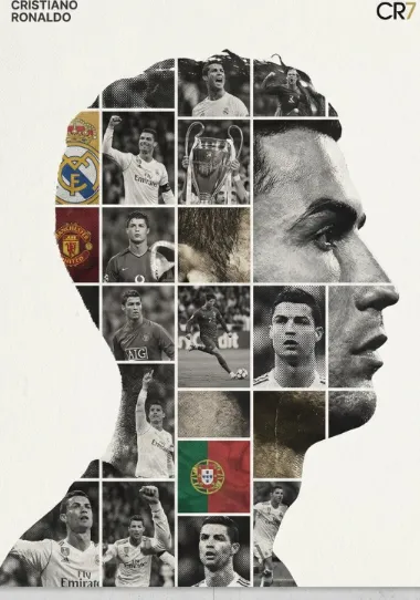
Luxury Monochrome Dual Exposure Tribute Poster
Luxury Monochrome Dual Exposure Tribute Poster: Ek Premium Editorial Visual Style
Om Editing Top style ka Luxury Monochrome Dual Exposure Tribute Poster ek aisa concept hai jo simple portrait ko collectible wall art mein convert kar deta hai. Isme subject ki photo ko center mein rakhkar uske andar multiple career moments, expressions, achievements, aur iconic visuals ko ek dense photo-grid composite mein layer kiya jata hai.
Read Also: cinematic-style realistic portrait | 2026 New Year
Ye style un logon ke liye perfect hai jo premium-looking tribute poster, fan art, sports editorial design, ya cinematic wall poster create karna chahte hain. Agar aap mobile se bhi powerful visual banana chahte ho, to Om Editing Top prompt-style approach aapko high-end monochrome look, strong composition, aur emotionally rich output dene mein help karti hai.
Is design ki khas baat ye hai ki ye sirf ek image collage nahi hota. Ye ek visual story hoti hai jisme black-and-white tone, dramatic contrast, aur mixed-media texture milkar subject ki legacy ko aur impactfully present karte hain. Result ek aisa poster banta hai jo refined, modern, aur gallery-worthy feel deta hai.
Ye Prompt/Photo Style Actually Kya Deta Hai
Is style ka main output ek bold monochrome tribute poster hota hai jisme portrait silhouette emotionally strongest element hota hai. Silhouette ke andar jo photo mosaic hota hai, wo career highlights, stage moments, sports action, ya memorable achievements ko ek organized grid mein show karta hai. Ye layout poster ko depth aur narrative deta hai.
Lighting usually high-contrast hoti hai, jisme whites clean aur blacks deep hote hain. Isse face outline, body contour, aur inset photos sab zyada dramatic lagte hain. Mood premium, serious, inspirational, aur slightly cinematic hota hai — jaise ek luxury exhibition print.
Composition ki baat karein to ye style balanced hota hai: large subject silhouette, tight photo-grid inside, aur subtle text placement. Monochrome palette overall elegant look deti hai, jabki selective color use rare accents ki tarah kaam karta hai. Texture effects jaise film grain, halftone dots, canvas feel, ya poster-paper finish design ko handcrafted aur collectible banate hain.
- High contrast: Black-and-white tones poster ko bold aur timeless banate hain.
- Photo mosaic: Inside silhouette multiple moments ek story ki tarah present hote hain.
- Mixed-media texture: Grain, halftone, aur fabric-like finish premium feel deti hai.
- Editorial composition: Clean spacing aur strong framing se luxury look aata hai.
- Selective color accents: Thoda sa color only important details ko highlight karta hai.
Om Editing Top Style Ko Step-by-Step Kaise Use Karein
Agar aap beginner ho, to is style ko mobile par use karna bhi kaafi manageable hai. Sabse pehle aapko clear idea chahiye ki poster kis person ke liye hai — athlete, actor, singer, creator, ya tribute subject. Uske baad best reference photos select karni hoti hain jisse AI ko strong subject identity mil sake.
Prompt style ko apply karte waqt goal hota hai detailed yet controlled output. Aapko bas concept ko samajhkar clean input dena hota hai: monochrome, dual exposure, photo-grid composite, luxury tribute poster, and textured editorial finish. Isse Om Editing Top type generation zyada focused aur visually consistent hoti hai.
Mobile users ke liye simplest flow ye hai: photo choose karo, prompt reference use karo, output generate karo, aur phir final poster mein minor adjustments check karo. Agar first result perfect na ho, to angle, lighting, ya photo selection change karke better iteration mil sakti hai.
- Best subject photo choose karo: Clear face, proper framing, aur sharp quality wali image select karo.
- Supporting photos prepare karo: Career moments, action shots, expressions, ya achievement images ready rakho.
- Style direction set karo: Decide karo ki final look zyada cinematic chahiye ya zyada editorial.
- Monochrome focus rakho: Black, white, and gray palette ko base banao.
- Texture preference add karo: Film grain, halftone, canvas, ya poster-paper feel indicate karo.
- Composition guide do: Portrait silhouette center mein, text top-left mein, collage inside silhouette.
- First output inspect karo: Face clarity, grid balance, aur contrast check karo.
- Need ho to refine karo: Better reference ya tighter composition ke saath regenerate karo.
Kaunsi Photos Is Style Mein Sabse Achchi Kaam Karti Hain
Is poster style ke liye best photos woh hoti hain jisme subject ka face clear ho aur outline easily recognizable ho. Medium-close portrait, front-facing ya slight three-quarter angle wali image sabse useful hoti hai, kyunki silhouette create karna easier hota hai. Blurry ya low-light photos se identity weak ho sakti hai.
Resolution bhi important hai. Agar source image sharp hogi to AI ko facial structure, hair shape, aur overall subject profile better samajh aayegi. Supporting images bhi crisp honi chahiye, especially agar aap photo-grid mein moments, poses, ya achievements dikhana chahte ho. Dark, noisy, ya over-compressed images final poster ki premium quality ko affect kar sakti hain.
Background aur clothing bhi matter karte hain. Simple background, clean contrast, aur solid-color clothing is style ke liye zyada effective hote hain kyunki subject isolation easy hoti hai. Busy background ya strongly patterned clothes kabhi-kabhi silhouette ke andar visual clutter create kar dete hain.
- Angle: Front-facing ya slight side angle best rehta hai.
- Resolution: High-resolution, sharp, aur well-defined image choose karein.
- Lighting: Soft but clear lighting face details ko preserve karti hai.
- Background: Clean, plain, aur non-distracting background better hota hai.
- Clothing: Solid colors aur simple outfits silhouette ko cleaner banate hain.
- Expression: Confident, calm, ya iconic expression poster ko stronger banata hai.
- Supporting shots: Action, awards, performance, ya milestone photos collage ke liye ideal hain.
Overall, Luxury Monochrome Dual Exposure Tribute Poster ek aisa visual format hai jo style aur storytelling dono ko ek saath combine karta hai. Agar aap Om Editing Top type premium result chahte ho, to clear photos, balanced monochrome direction, aur strong composition sabse important factors hain.
Pro Tips for the Best Results with Om Editing Top
To get the most premium look from Om Editing Top, start by treating the design like a collectible poster instead of a simple edit. The stronger the source photos, the better the final monochrome dual exposure effect will feel. High-resolution portraits, clear action shots, and images with distinct silhouettes work especially well because they give the composition more depth and structure.
Another smart approach is to keep the visual story focused. If the images inside the grid share a common theme, such as achievements, iconic moments, or a specific era, the poster feels more intentional and powerful. This is especially useful when creating tribute-style edits, portfolio covers, or luxury wall-art compositions where the mood should stay elegant and cohesive.
- Use clear portrait images with strong contrast so the silhouette stays sharp and dramatic.
- Choose photos that tell one story, such as career highlights, memorable performances, or personal milestones.
- Keep the black-and-white balance consistent so the tribute poster looks luxurious and polished.
- Test different crop ratios to make sure the subject stays centered and the mosaic grid remains readable.
- Use subtle textures and grain to give the image a handcrafted, editorial feel.
- Leave enough breathing space around the title and emblem so the composition does not feel crowded.
Common Mistakes to Avoid in Om Editing Top
One of the biggest mistakes is using low-quality images inside the dual exposure grid. When the photos are blurry, dark, or heavily compressed, the whole poster can lose its premium finish. Since Om Editing Top is designed to look refined and collectible, every source image should feel deliberate and visually strong.
Another common issue is overloading the layout with too many effects. Too much color, heavy glow, or excessive contrast can damage the monochrome tribute style and make the poster feel less sophisticated. The strongest versions of this look usually rely on restraint, clean structure, and well-placed detail instead of visual noise.
- Do not use random mixed photos that have no visual or emotional connection, because the tribute idea becomes weak.
- Avoid overcrowding the silhouette with too many tiny details, as the main portrait may lose impact.
- Do not make the title too large or too bold, because it can overpower the central artwork.
- Skip low-light or grainy source photos unless they are intentionally styled, since they can reduce clarity.
- Do not add too many colors, because the monochrome luxury effect depends on visual discipline.
- Avoid uneven spacing in the photo grid, as messy alignment can make the poster look amateurish.
Best Use Cases for Om Editing Top
Om Editing Top works beautifully for a wide range of visual uses because it combines editorial style with emotional storytelling. The luxury monochrome treatment makes it ideal for tribute posters, fan art, milestone collages, and high-end social media graphics. It can also work as a statement piece for a personal brand, especially when the subject has a strong public identity or a memorable visual legacy.
This style is also highly effective for digital platforms where first impressions matter. On Instagram, the bold silhouette and detailed mosaic grid can stop the scroll immediately. For YouTube thumbnails or reel covers, the design can create a polished, cinematic feel that communicates prestige and importance in a single glance.
- Instagram posts: Great for tribute graphics, announcement posts, and high-impact feed edits.
- Profile pictures: Works well as a cropped, high-contrast avatar with strong visual identity.
- YouTube thumbnails: Useful when you want a premium, documentary-style look that stands out fast.
- Reels covers: Adds a dramatic and classy frame to highlight key moments or stories.
- Portfolios: Perfect for designers who want to show luxury composite editing skills.
- Wall art prints: Suitable for collectible poster-style designs and memorial display pieces.
Variations You Can Try with Om Editing Top
One reason Om Editing Top is so versatile is that you can shift the mood without losing the core luxury identity. By changing the expressions, photo selection, and texture balance, you can create a version that feels more cinematic, more emotional, or more editorial. Small changes in tone often make a big difference in how the final poster feels.
You can also experiment with seasons, lighting styles, and background energy while still keeping the monochrome structure intact. A winter-inspired version may feel colder and more dramatic, while a warm-toned monochrome edit can create a nostalgic or reflective mood. Even within a strict black-and-white palette, subtle differences in contrast and grain can completely transform the artwork.
- Classic luxury: Clean monochrome with sharp contrast and minimal extra texture.
- Vintage tribute: Add stronger film grain and softer tonal transitions for an archival feel.
- Cinematic mood: Use deeper shadows and brighter highlights for a dramatic poster effect.
- Editorial style: Keep the layout sleek, minimal, and highly structured.
- Seasonal variations: Build winter, summer, or festival-inspired photo selections inside the grid.
- Emotion-driven versions: Choose smiling, intense, or reflective photos depending on the message you want.
Final Thoughts on Om Editing Top
Om Editing Top is a strong choice when you want a tribute poster that feels premium, emotional, and visually memorable. The monochrome dual exposure style gives you space to tell a story through portraits, moments, and textures while still keeping the artwork elegant and controlled.
If you want your next design to look like collectible wall art or a high-end social media feature, this style is worth trying. Use thoughtful photo selection, keep the palette refined, and let Om Editing Top do the heavy lifting for a powerful final result.
💬 Comments