Food design biryani
Om Editing Top क्या है और Food design biryani के लिए क्यों काम करता है?
Om Editing Top स्टाइल का मकसद ऐसा eye-catching food poster बनाना है जो पहली नज़र में ही premium, professional और appetizing लगे। Food design biryani जैसे टॉपिक में यह खास तौर पर useful होता है, क्योंकि बिरयानी खुद एक rich, layered और visually appealing dish है — और सही design prompt उसे restaurant poster की तरह present कर सकता है।
Read Also: cinematic-style realistic portrait | 2026 New Year
यह style उन लोगों के लिए best है जो social media post, restaurant promotion, delivery ad, menu banner, या digital marketing creative बनाना चाहते हैं। अगर आप food photography, poster design, AI image generation, या promo graphic work करते हैं, तो इस तरह का prompt आपको fast, polished और commercial-looking result देने में मदद करता है।
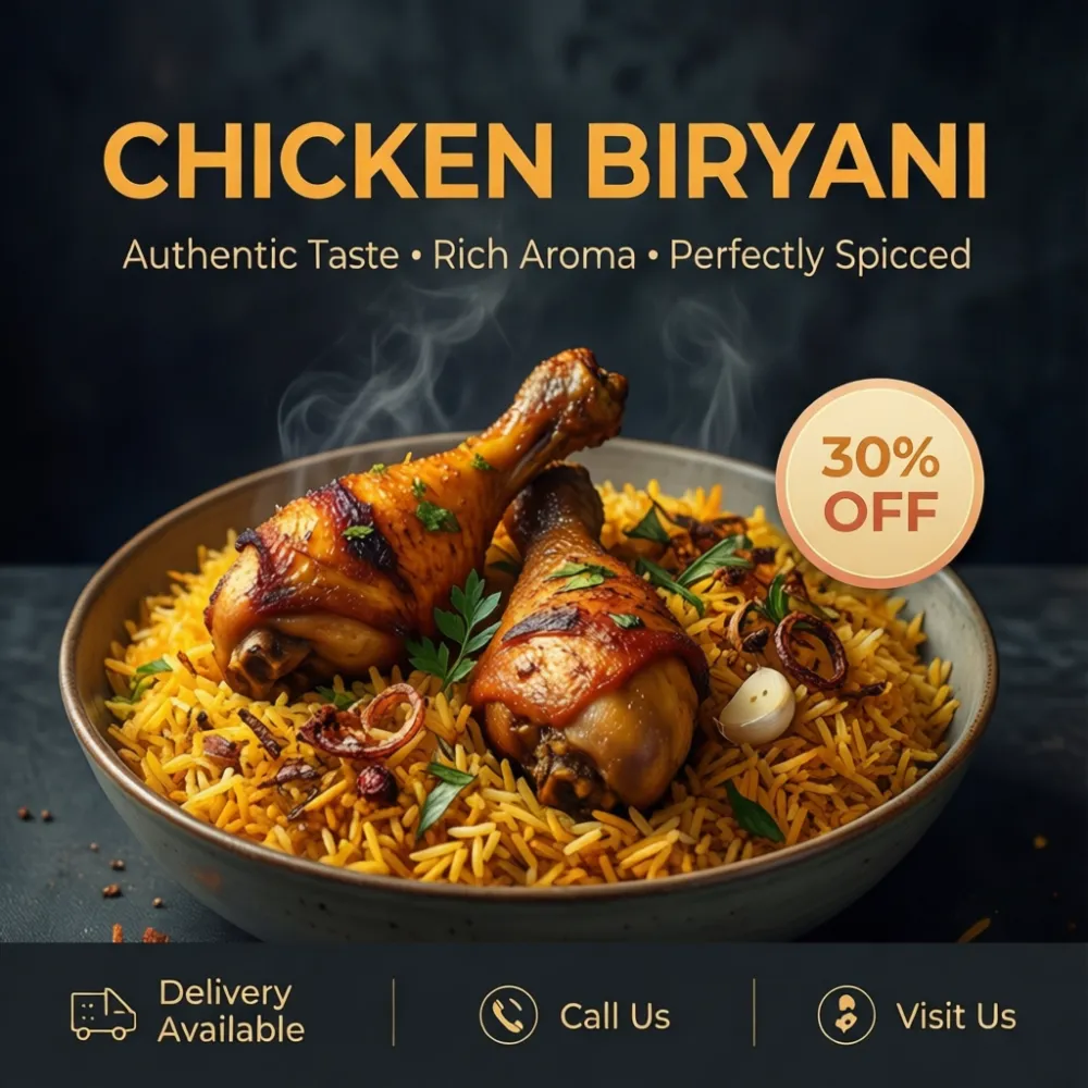
Simple words में, यह सिर्फ biryani की photo नहीं बनाता — यह उसे एक marketing asset में बदल देता है। Bowl placement, steam effect, garnishing, dark background, cinematic lighting और clean layout मिलकर ऐसा visual बनाते हैं जो trustworthy भी लगता है और delicious भी।
इस prompt से आपको कैसी visual style मिलती है?
Food design biryani का सबसे strong part उसका premium restaurant poster feel है। Dark charcoal background food colors को और ज़्यादा highlight करता है, जिससे golden rice, roasted chicken drumsticks, herbs और fried onions naturally pop करते हैं। Soft lighting image को harsh नहीं बनाती, बल्कि उसे calm, elegant और appetizing बनाती है।
इस style में focus सिर्फ dish पर नहीं, बल्कि overall composition पर भी होता है। Bowl अक्सर slightly lower-center रखा जाता है ताकि ऊपर headline के लिए space बचे। Steam rising effect dish को freshly cooked दिखाता है, और saffron basmati rice की texture image को realistic बनाती है।
अगर goal professional-looking restaurant poster है, तो यह layout बहुत effective है क्योंकि इसमें visual hierarchy साफ रहती है। Headline ऊपर, tagline नीचे, discount badge side में, और contact/delivery strip नीचे — ये सब मिलकर design को ad-ready बनाते हैं।
- Lighting: soft, cinematic, natural-looking highlights
- Mood: premium, warm, trustworthy, restaurant-style
- Colours: rich food tones, dark neutral background, calm accents
- Composition: centered or slightly lower-center food placement
- Realism: visible steam, detailed rice grains, textured garnish
This Style ko use kaise karein? Step-by-step guide
Agar aap beginner हैं और mobile phone से काम कर रहे हैं, तो भी इस style को use करना simple है। सबसे पहले आपको अपने design tool या AI image generator में सही prompt structure समझना होगा। Prompt में food, background, mood, layout और text placement जैसी instructions साफ honi chahiye, ताकि output control में रहे।
Best results के लिए एक clear topic चुनें — यहाँ topic है Chicken Biryani. फिर image को restaurant poster की तरह सोचें, न कि random food photo की तरह। जितना structured आपका input होगा, उतना refined output मिलेगा।
Step-by-step process follow करें:
- अपने app या editor में नया project खोलें और poster ratio चुनें, जैसे square या vertical social post.
- Main subject के रूप में biryani dish define करें, ताकि model को पता चले कि focus किस पर है.
- Lighting और background instructions जोड़ें, जैसे dark textured background और soft cinematic lighting.
- Composition clear रखें — bowl slightly lower-center, headline area ऊपर, information strip नीचे.
- Food details mention करें: steam, saffron rice, roasted chicken drumsticks, herbs, fried onions, spices.
- Color mood specify करें ताकि output harsh red या neon tone में न जाए.
- Generate करके preview देखें, फिर जरूरत हो तो placement, brightness या contrast adjust करें.
- Final image को mobile-friendly size में export करें ताकि social media और WhatsApp sharing आसान हो.
Best photo style कौन-सी photos पर अच्छा काम करती है?
इस तरह की food design biryani style के लिए सबसे अच्छे source photos वे होते हैं जिनमें dish साफ, sharp और appetizing दिखे। अगर आप real photo use कर रहे हैं, तो bowl का angle बहुत important है। Slight top angle या 3/4 angle usually सबसे अच्छा लगता है, क्योंकि इससे rice texture भी दिखती है और chicken pieces भी clearly visible रहते हैं।
Resolution high होनी चाहिए, वरना poster design में zoom करने पर detail टूट सकती है। अच्छी lighting natural या soft studio light जैसी होनी चाहिए। बहुत harsh flash image को flat बना देती है, जबकि balanced light biryani की sheen, spice texture और steam effect को better दिखाती है।
Background भी बेहद practical role निभाता है। Busy kitchen background, cluttered table या बहुत colorful surface design को messy बना सकती है। इसके बजाय clean, neutral, dark, or lightly textured background बेहतर रहता है। Clothing अगर chef image या people-based poster में हो, तो plain, neat, restaurant-appropriate uniform सबसे अच्छा लगता है।
- Angle: slight top view या 3/4 view
- Resolution: high-resolution, sharp focus
- Lighting: soft, even, steam-friendly, non-harsh
- Background: dark, clean, textured, non-distracting
- Food styling: visible garnish, neat plating, rich rice layers
- Clothing for human shots: clean chef wear, simple restaurant uniform
Food design biryani में composition और layout को सही कैसे रखें?
एक strong poster सिर्फ अच्छी biryani image से नहीं बनता; उसकी composition भी balanced होनी चाहिए। इस तरह के design में top area headline के लिए छोड़ा जाता है, जिससे text readable रहता है और food image crowd नहीं होती। Lower-center food placement user का focus सीधे dish पर ले आता है।
Discount badge, tagline और bottom strip जैसे elements poster को informative बनाते हैं। यह खास तौर पर restaurant promotions में useful है, क्योंकि viewer को एक ही glance में deal, delivery details और contact information मिल जाती है। अगर layout clutter-free रहे, तो poster ज्यादा professional लगेगा।
आप इस style को use करके अलग-अलग campaigns भी बना सकते हैं — जैसे lunch offer, weekend special, combo deal, or restaurant launch creative. Bas structure same रखिए, और supporting text बदलते रहिए।
- ऊपर headline area खाली रखें
- Food subject को central attention दें
- Text और image के बीच breathing space रखें
- Badge या offer element छोटा लेकिन visible रखें
- Bottom strip में delivery/contact info clean रखें
This Style किस तरह के users के लिए सबसे useful है?
यह style सिर्फ designers के लिए नहीं, बल्कि छोटे restaurant owners, food delivery brands, freelance editors, social media managers और content creators के लिए भी useful है। अगर आपको जल्दी में attractive promo बनाना हो, तो यह format काम आ सकता है क्योंकि इसमें ready-made visual direction मिलती है और decision-making आसान हो जाती है।
Beginners के लिए भी यह beginner-friendly है, क्योंकि prompt में already clear structure मौजूद है — food subject, background, mood, and layout. इससे trial-and-error कम होता है और output ज्यादा consistent मिलता है।
अगर आप future में इसी style से और food creatives बनाना चाहते हैं, तो biryani के अलावा kebab, curry, burger, pizza, or dessert posters भी इसी visual formula में तैयार किए जा सकते हैं। यही reason है कि Om Editing Top type prompts practical, scalable और content creators के लिए बहुत helpful होते हैं।
Pro tips for the best results with This Style
If you want your Om Editing Top design to look more premium and restaurant-ready, the small details matter just as much as the main food subject. Keep the composition clean, leave enough breathing space for the headline, and make sure the dish feels like the hero of the poster. A strong visual balance between the biryani bowl, the dark background, and the text areas will make the final design look more professional and polished.
For the best output, focus on lighting, texture, and ingredient clarity. The rice should look fluffy and aromatic, the chicken should feel juicy and well-roasted, and the garnish should add freshness without making the poster look crowded. A subtle cinematic glow can make the food appear richer, while a neat layout helps the poster feel trustworthy and polished for real restaurant use.
- Keep the biryani bowl slightly lower-center so the top remains open for the headline and tagline.
- Use warm food tones with calm dark surroundings to make the dish stand out naturally.
- Show steam lightly and realistically, because it adds freshness and appetite appeal.
- Make the garnish visible but controlled, so the poster still looks premium and not messy.
- Leave space for the discount badge and contact strip so the design stays structured.
- Choose soft cinematic lighting to enhance texture without creating harsh reflections.
Common mistakes to avoid in This Style designs
One of the biggest mistakes in Om Editing Top style posters is overloading the image with too many strong colors or too many design elements. When the background becomes too bright or the accents become too loud, the food loses its premium feel. Since this design is meant to look like a real restaurant promotional poster, the composition should stay elegant, readable, and visually calm.
Another common issue is hiding the main dish under excessive decoration. If the bowl is too small, the steam is too heavy, or the garnish is too busy, the biryani will not feel appetizing enough. The goal is to create a clean food-advertising look where the chicken biryani remains the clear focus, while the badge, headline, and information strip support the design instead of competing with it.
- Do not use neon or overly harsh red tones, because they can make the poster feel cheap and visually tiring.
- Do not place too much text near the food, because it reduces the premium restaurant-poster effect.
- Do not make the steam unrealistically thick, because it can hide the dish details.
- Do not clutter the background with extra objects, because the poster should feel clean and focused.
- Do not ignore spacing, because poor layout makes even a beautiful food image look unprofessional.
Best use cases and ideas for This Style
The Om Editing Top concept works especially well for food marketing content where the goal is to grab attention quickly and make the dish look irresistible. A biryani poster like this can be used across digital and print platforms, especially when the restaurant wants a modern, premium, and trustworthy presentation. The combination of rich food photography and structured advertising layout makes it suitable for many promotional needs.
You can use this style for restaurant campaigns, food delivery ads, festive offers, and social media promotions. It also works well when you need a visual that looks professional enough for branding, but still feels warm and appetizing. Because the composition includes a headline space, tagline area, discount badge, and bottom contact section, it adapts easily to multiple marketing formats.
- Instagram posts: Perfect for promoting special biryani offers or weekend deals.
- Profile pictures: A cropped food image or brand-style visual can work for pages and restaurant accounts.
- YouTube thumbnails: Great for food review videos, recipe content, or restaurant vlog thumbnails.
- Portfolio showcase: Useful for designers who want to display premium food poster design work.
- Reels covers: Helps create a clean, clickable cover for biryani-making or restaurant promo reels.
- Delivery promotions: Ideal for ads featuring contact numbers, address details, and offer badges.
Variations you can try with This Style
One of the best parts of using Om Editing Top is that you can experiment with different moods without losing the premium restaurant feel. Small changes in color palette, lighting, or setting can completely shift the personality of the poster. This makes it easy to create multiple versions for different seasons, events, or marketing campaigns while keeping the same core food appeal.
You can also try changing the atmosphere to match the occasion. For example, a richer gold-toned version can feel festive, while a cooler dark-neutral version can feel more modern and upscale. If you want the design to appear more seasonal, you can adjust the garnish, background tone, or accent colors while keeping the biryani itself appetizing and realistic.
- Moody premium look: Use deep charcoal tones with soft cinematic lighting for a luxury restaurant feel.
- Warm festive version: Add golden accents and richer rice tones for celebratory promotions.
- Fresh delivery style: Keep the layout crisp and balanced for online food order campaigns.
- Winter special mood: Add slightly stronger steam and deeper shadows for a comforting feel.
- Summer clean style: Use lighter accent balance while keeping the food rich and vivid.
- Traditional restaurant version: Emphasize herbs, spices, and a more authentic handcrafted presentation.
Conclusion: why This Style works so well
Om Editing Top is a strong choice when you want a biryani poster that feels premium, modern, and ready for real promotional use. It brings together appetizing food presentation, clean poster structure, and a trustworthy restaurant-style mood in one design. That makes it ideal for marketers, restaurant owners, and creators who want something eye-catching but still elegant.
If you want your food visual to look professional and memorable, try experimenting with this style and adjust the mood to match your brand. With the right balance of lighting, layout, and color, Om Editing Top can turn a simple chicken biryani concept into a polished promotional image that instantly grabs attention.
💬 Comments